AWS Cost Efficiency Metric

Giving AWS customers the clarity to measure, benchmark, and act on cloud cost efficiency through a standardized, automated metric built for scale.
Timeline
September - November 2025
Role
UX/Product Designer
Skills
UX Strategy, Iterative Design, Research, Wireframing, Prototyping, Data Visualization
Impact
85% adoption rate · Free capability · 90 days historical data

Measuring what matters

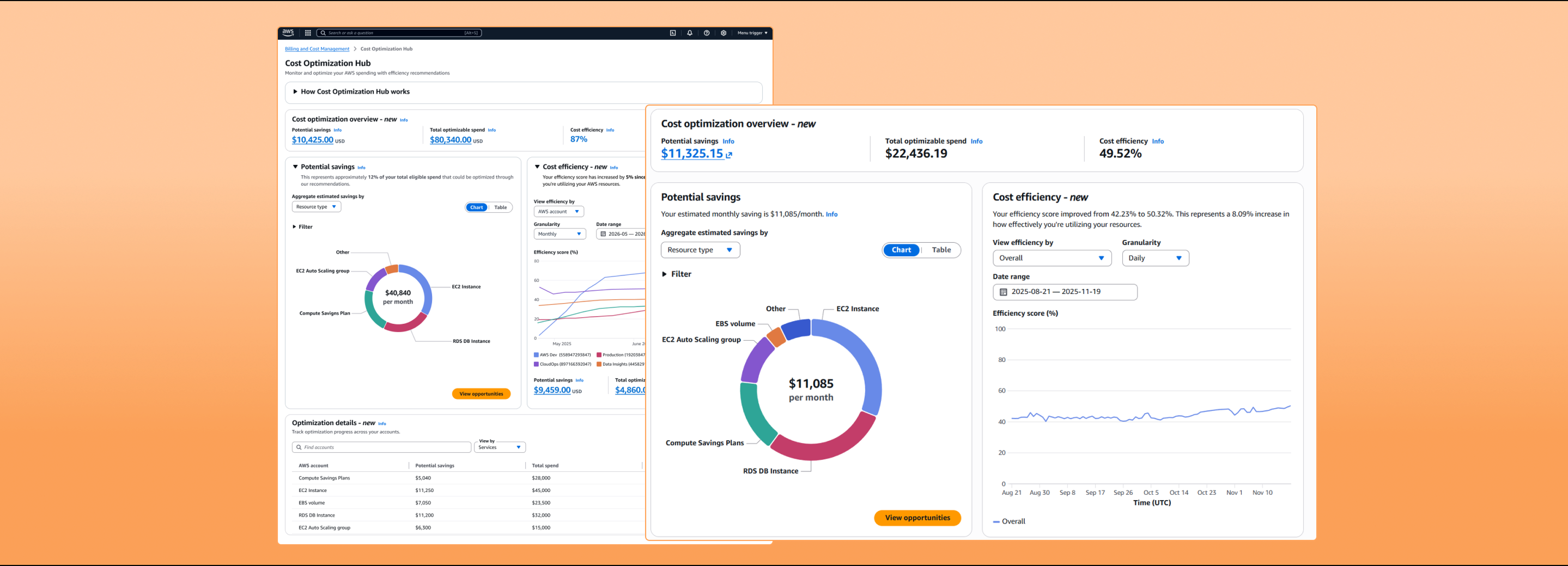
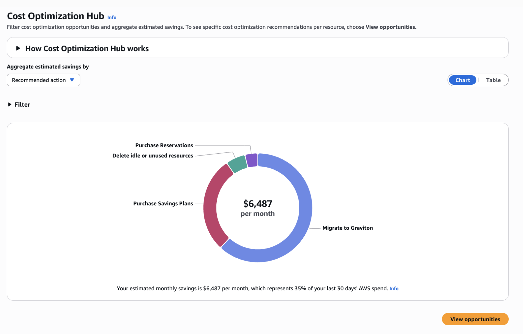
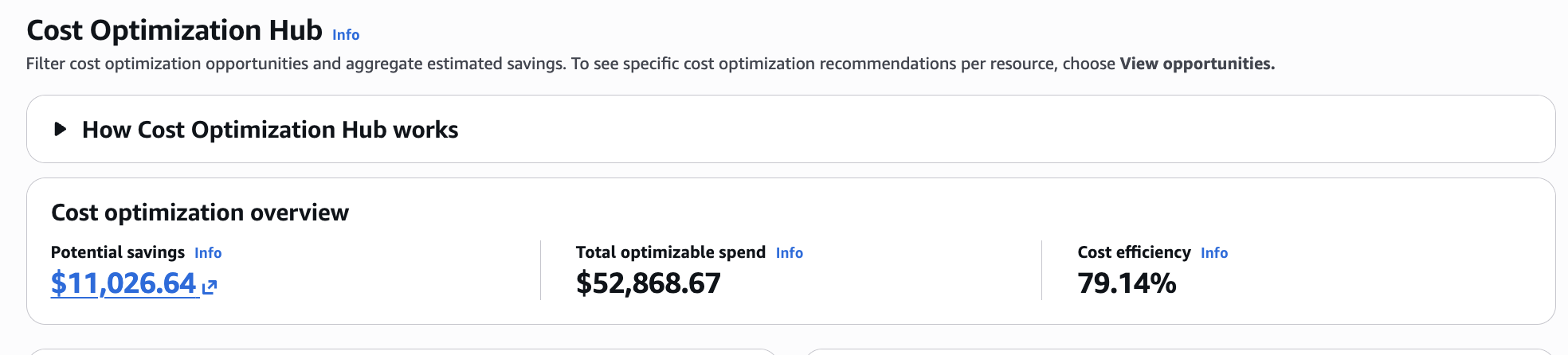
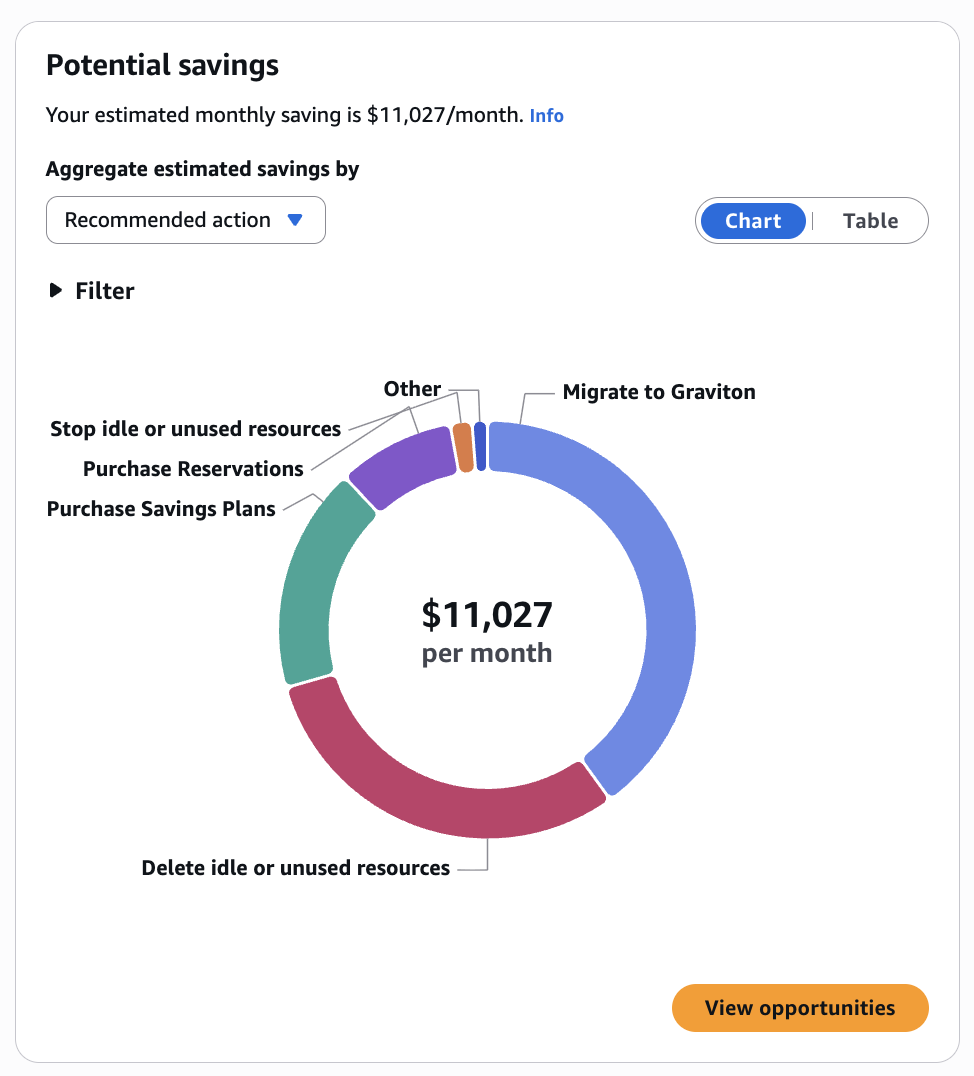
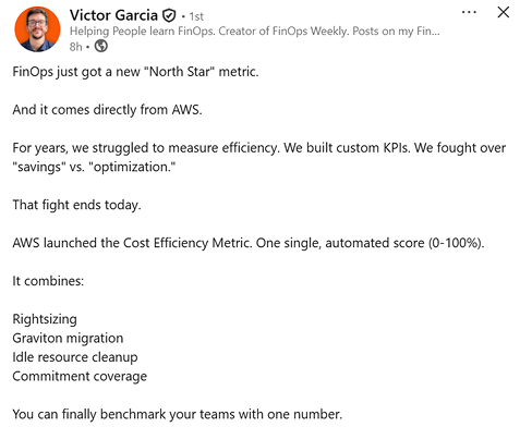
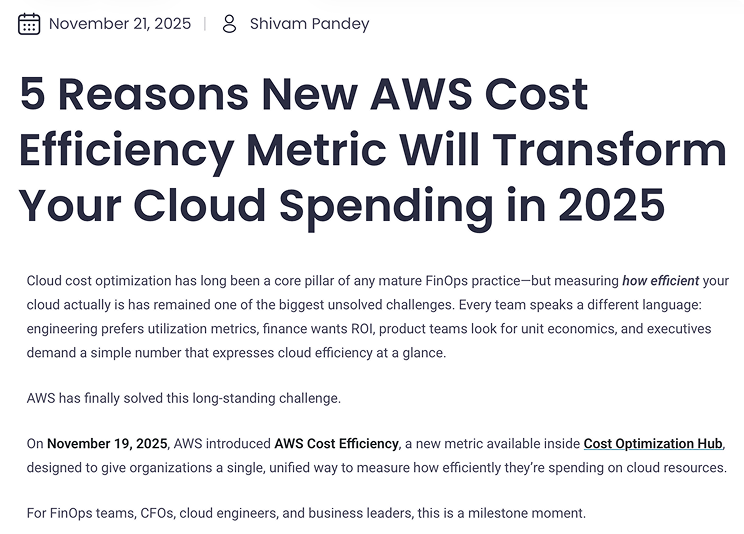
The Cost Efficiency Metric is a new feature in the AWS Cost Optimization Hub that launched in November 2025. Cost Optimization Hub helps customers identify and implement cost-saving opportunities across their AWS infrastructure, but lacked a standardized way to measure how efficiently customers were acting on those recommendations.

Without it, teams relied on fragmented approaches like CPU utilization metrics, savings plan discount rates, and custom spreadsheets that provided only partial views and weren't comparable across teams or business units.

Teams knew they had cost-saving opportunities. What they didn't know was how well they were capturing them.

Learning from the field

I collaborated with product managers to validate feature priorities through interviews with enterprise customers and AWS field team members. We uncovered critical gaps that customers needed addressed to measure and track cloud cost efficiency.

No standardized measurement process

Every organization relied on fragmented approaches that provided only partial views and couldn't be compared across teams or business units, making benchmarking impossible.

Manual processes creating organizational friction 

The manual effort required to pull data from multiple tools created inconsistent results and ongoing disagreements about what efficiency actually looked like.

Brand credibility as a trust signal

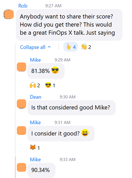
Customers who had built similar internal tools still preferred an AWS-backed solution because it removed the internal debate about whether the numbers could be trusted.

Educational and transparency gap

Without a single source of truth, cloud teams were left manually reconciling data across disconnected tools, a process that invited debate and made it nearly impossible to trust the results.

User journey mapping

Designing through ambiguity

I oriented myself to the product space quickly and led iterative feedback sessions with engineering and stakeholder partners. Using internal AI tools to pressure-test ideas and explore directions, I focused on how the efficiency score should be displayed, how customers would discover it, and what ingress points to consider. Throughout, I advocated for the customer while navigating real technical and time constraints.

Three Competing Views

The efficiency score, potential savings, and optimization details table each had their own filtering logic and couldn't share a single filter, so the design had to present each view clearly and independently.

Education In Context

Informational links were integrated directly into the interface, giving customers the context to understand the efficiency score without leaving the page.

Dashboard Experience

I proposed anchoring the experience with a KPI overview section, ensuring customers could quickly orient themselves before exploring the efficiency score, savings, and optimization details.

Three design directions explored
FINAL DESIGN

Cost efficiency, visible at every level

The redesigned Cost Optimization Hub surfaces a cost efficiency score alongside existing savings data, giving users a normalized measure of resource utilization that works at the account level, by service, by region, and over time.
before / after

From absolute savings to efficiency at a glance

Before
The original hub showed potential savings as an absolute dollar figure broken down by recommended action. Users could see what they might save, but had no way to assess whether their spending was efficient relative to actual usage.
After
Cost Efficiency Metric introduces an efficiency score displayed in three places: a top-level overview strip, a dedicated trend chart, and a per-service breakdown table. Users can now answer "are we getting more efficient?" without building a custom query.
How it works

Three surfaces, one metric

01 — Overview Strip
Account-level health signal
The summary at the top of the hub now shows three numbers side by side: Potential savings, Total optimizable spend, and Cost efficiency. The score appears at the account level so users get a health signal before drilling into any detail.
→ New cost efficiency score at account level
02 — Efficiency Chart
Trend with plain-language summary
The cost efficiency panel lets users slice the score by service, account, region, or recommended action with daily, weekly, or monthly granularity. A summary sentence above the chart translates the trend into plain language: no interpretation required.
→ Plain-language summary above every chart
03 — Potential Savings
Context for every recommendation
The savings panel operates alongside the efficiency score so users can see both what they could save and how efficiently they are currently spending. Aggregation by recommended action, account, or service lets teams prioritize across dimensions, not just by dollar value.
→ Savings data retained alongside the new efficiency metric
Design decisions

Three principles that shaped the outcome

Efficiency alongside savings, not instead of it
Replacing savings data with an efficiency score would have broken existing workflows. CEM is additive — the score appears alongside dollar figures so users retain the absolute context they already rely on.
Plain-language summary above every chart
Both panels open with a sentence that interprets the data. The design does not ask users to read a chart and draw their own conclusion — the summary does that work up front.
Consistent metric across all three surfaces
The same efficiency percentage appears in the overview strip, the trend chart, and the table — calculated the same way at every level. Users moving between views see a coherent number, not an approximation that shifts by context.
Impact of new experience
adoption
85% adoption rate
efficiency gain
60% → 82% in 6 months
Giving customers a single, reliable way to track optimization progress and demonstrate ROI. Launched as a free capability within the AWS Billing and Cost Management Console, it included daily updates and 90 days of historical data at launch. One customer achieved $4.6M in annual savings and a 37% reduction in waste even as infrastructure grew by 15%.

Social media mentions

From the community

Lessons learned

Designing CEM reinforced that enterprise customers arrive with existing workflows and benchmarks, so flexibility has to be built in from the start. Deeper upfront research into active usage patterns would have grounded key decisions more firmly. A natural next step is exploring predictive features that show customers how specific actions would move their score, once the technical capabilities are in place to support it.
Thank you!

I’m happy to continue a more in depth conversation on my process for navigating complex systems and creating impactful user experiences. Feel free to email me or reach out through LinkedIn.