
The Customer Carbon Footprint Tool helps organizations track carbon emissions from their cloud infrastructure. Over time, it became clear the tool had significant limitations. It only showed emissions at a continental level, used a single calculation method, and lacked the visualizations teams needed to make sense of their data.
This made it difficult for customers to meet reporting standards, plan infrastructure changes, or track their progress on emissions reduction.
I partnered with Product and Research to validate feature priorities through interviews and a customer roundtable. We uncovered regional granularity and LBM data as missing capabilities that customers needed to make informed decisions.
The absence of Location-Based Method (LBM) emissions data prevented customers from meeting GHG Protocol's dual reporting requirement, making it impossible to use CCFT as their primary carbon tracking tool.
Regional granularity emerged as a critical competitive disadvantage, with customers reporting detailed carbon data from other cloud providers but lacking equivalent visibility from AWS.
The absence of Location-Based Method (LBM) emissions data prevented customers from meeting GHG Protocol's dual reporting requirement, making it impossible to use CCFT as their primary carbon tracking tool.
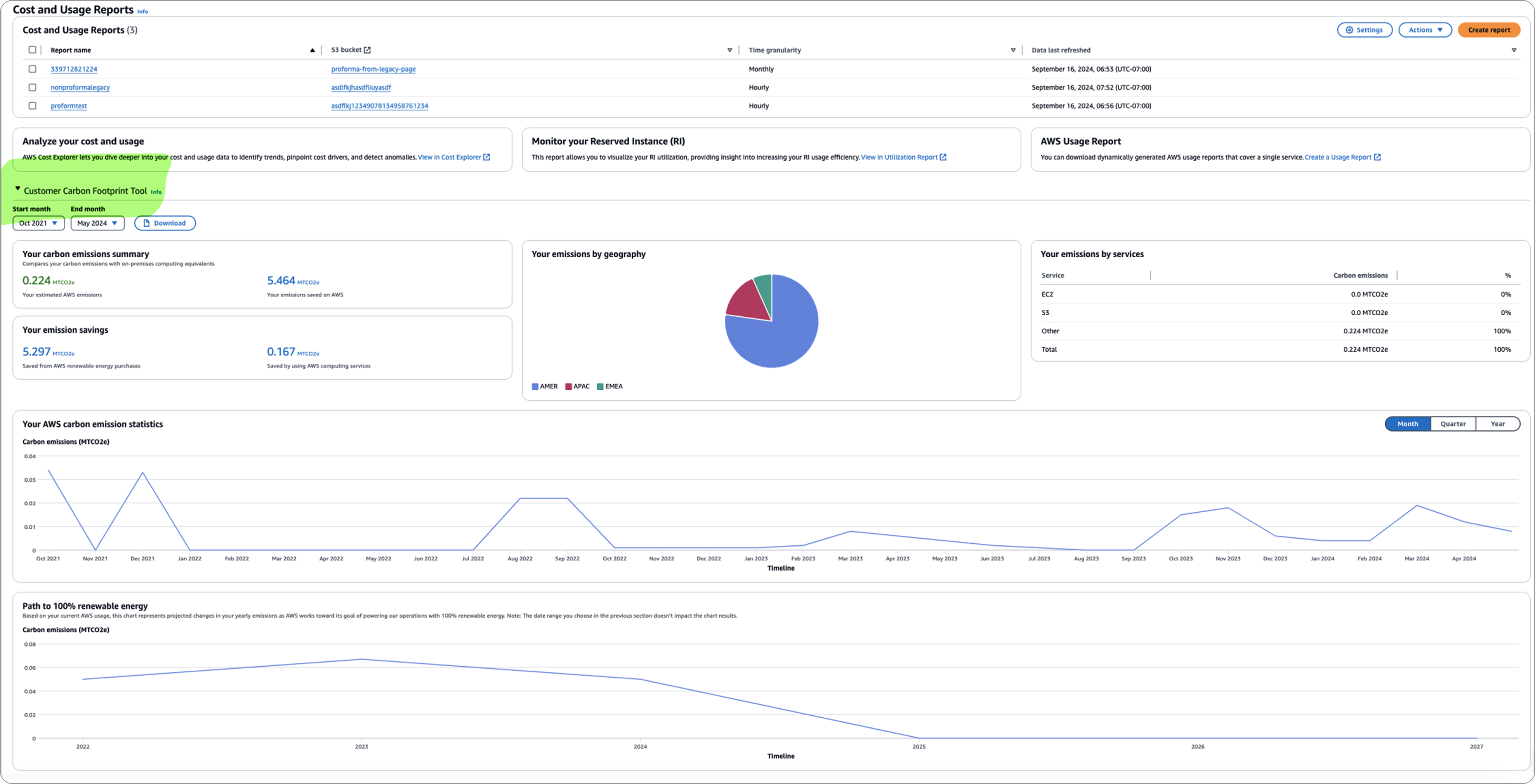
The existing geography-level pie chart (AMER, APAC, EMEA) lacked contextual information and was too broad for customers to make informed decisions about workload placement or identify specific optimization opportunities.

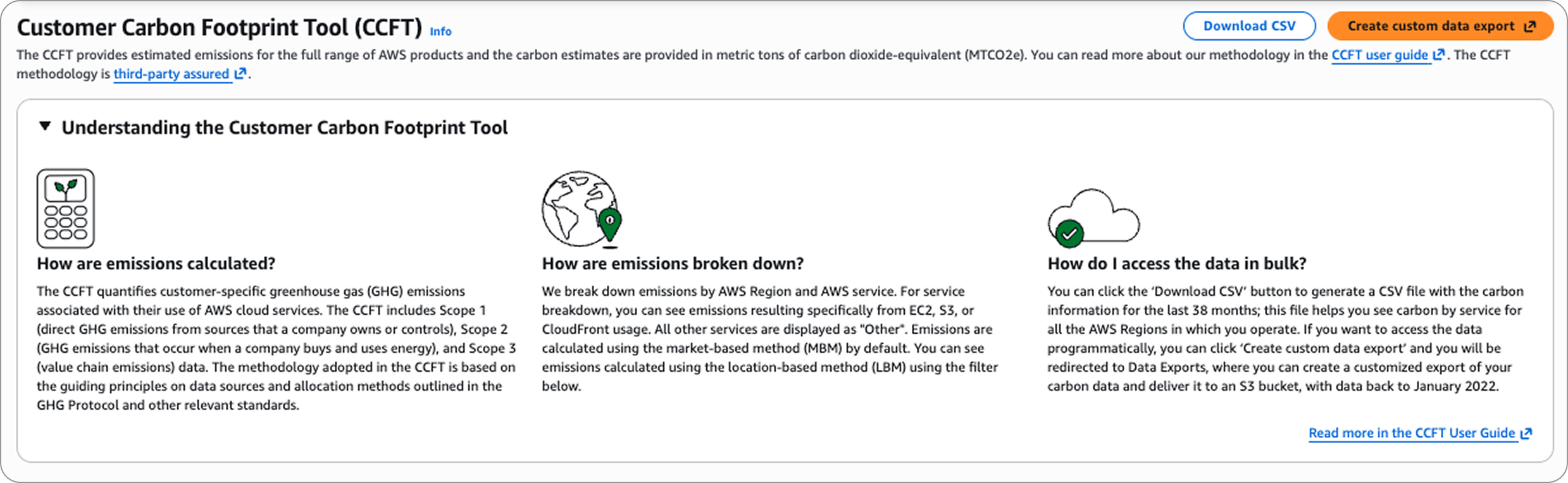
This tool was designed to help customers track and interpret their carbon footprint data. The design process was deeply collaborative; shaped through ongoing feedback reviews, iterative partner sessions, and close alignment with engineering to navigate real technical constraints.
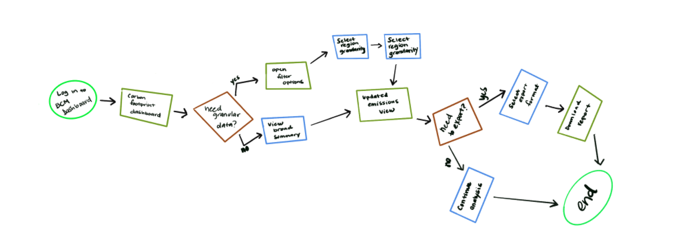
Technical constraints ruled out a split panel, so I pivoted to inline filtering, keeping the experience clean and buildable.
Partner feedback revealed users needed more context, so an educational component was integrated directly into the tool.
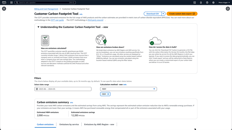
A tabbed structure collapsed a multi-page journey into one cohesive view, validated through design reviews.
A significant data gap between datasets made a combined graph visually misleading, so they were separated into distinct visualizations for clarity.

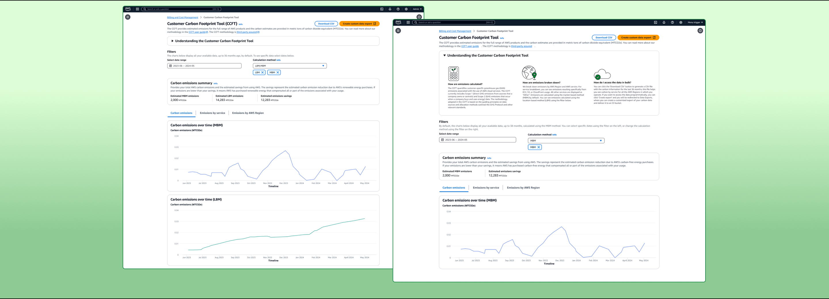
Previously nested inside Cost and Usage Reports, the tool had no dedicated home and showed emissions only at a continental level. The redesign gave it a standalone presence in the navigation and introduced regional granularity, dual calculation support, and contextual guidance.
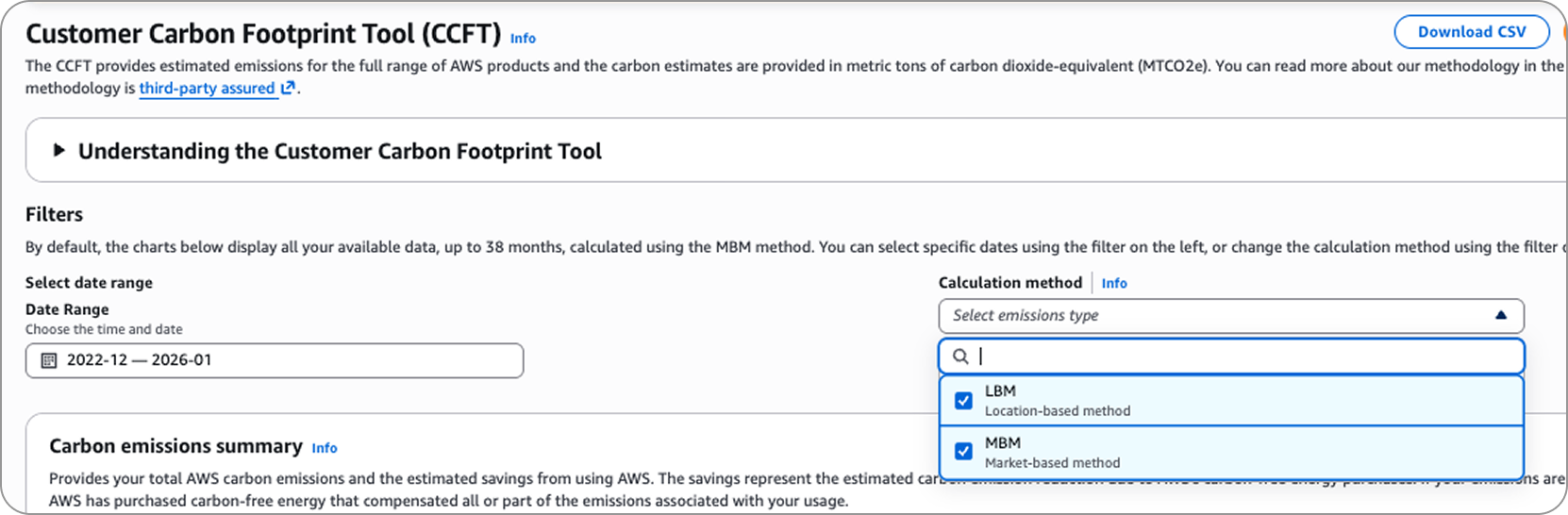
Customers can now switch between Market-Based and Location-Based calculation methods, meeting GHG Protocol's dual reporting requirement and enabling CCFT to be used as a primary compliance tool.
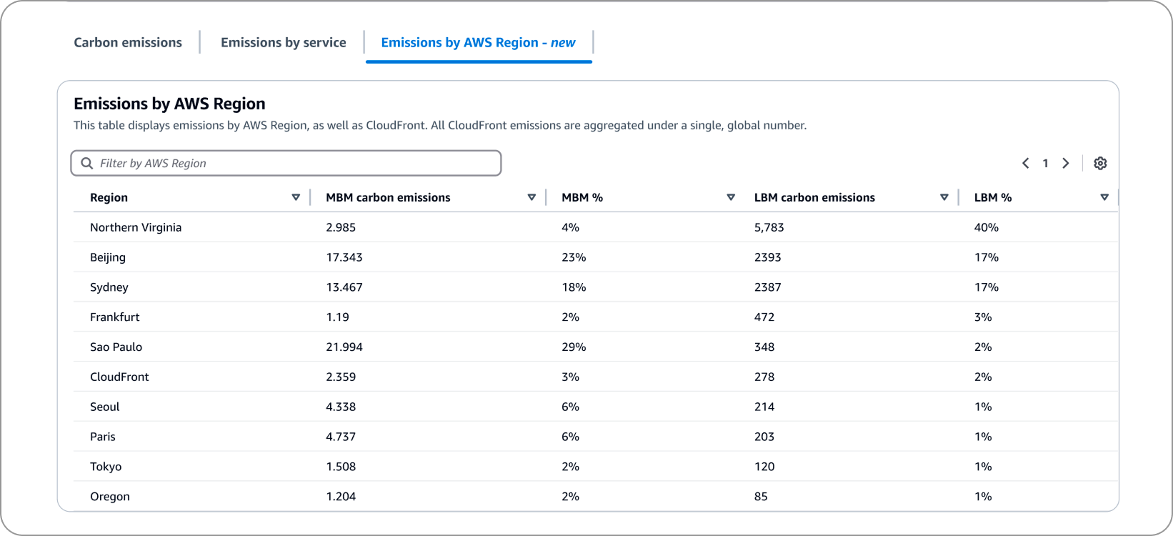
Emissions data is now broken down by AWS region rather than broad continental zones, giving teams the granularity they need to make informed workload placement decisions and align carbon data with billing data.
An educational component was integrated directly into the tool, providing contextual guidance on calculation methods and emissions breakdowns — reducing confusion and empowering teams to act on their data independently.
Previously nested inside Cost and Usage Reports, the tool had no dedicated home and showed emissions only at a continental level. The redesign gave it a standalone presence in the navigation and contextual guidance.
This project taught me that constraints can be a creative advantage. Working across unfamiliar partner teams pushed me to communicate more clearly and adapt quickly. If I had more time, I'd have pushed for richer data visualizations and more one-on-one partner conversations early on.
I’m happy to continue a more in depth conversation on my process for navigating complex systems and creating impactful user experiences. Feel free to email me or reach out through LinkedIn.